
Those beautiful urns full of charming flowers, set against a dark background you see a lot of at the moment? "Dutch masters style flowers" they call them. Something like this:
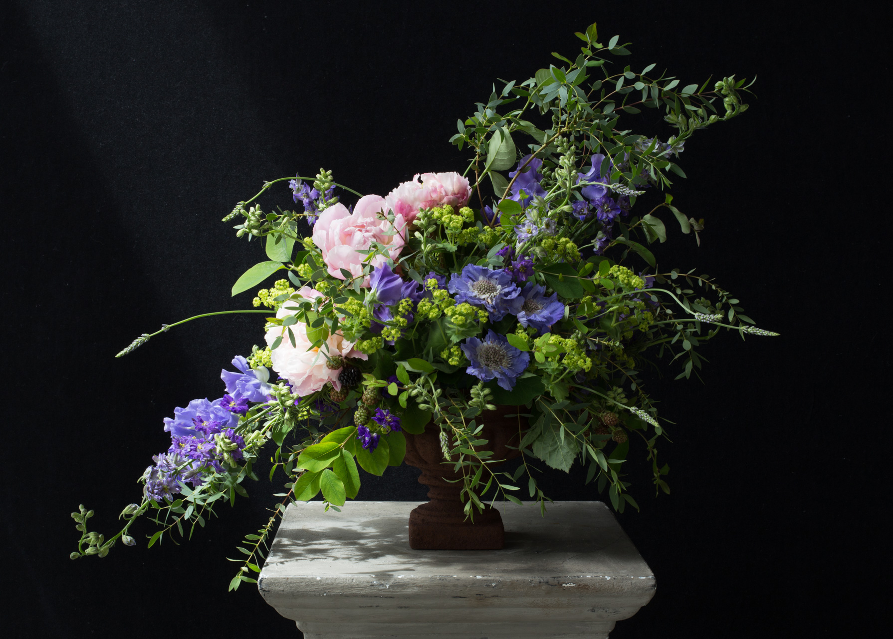
Well I now know they are nothing at all like Dutch masters style flowers.
In just an hour, on one afternoon of the historical flowers course at the Sussex Flower School, Georgia described, blow by blow, how little this arrangement (which I did with her help) has nothing in common with the Dutch masters.
Here's why:

1. This is what the Dutch masters style flower arrangements actually looked like in the early 1600s, when this style started. The Hogarth curve beloved of 21st century floral design didn't make an appearance until the mid 1700s.
2. These designs were never actually displayed in real life. No one put urns of flowers like this in their homes. For one thing they are mechanically impossible to achieve, and for another you would never get tulips, peonies and lilies all blooming at the same time. These still lives existed only in the imaginations of the painters.
3. There was a strict hierarchy of flowers and objects painted: the most important, expensive and difficult to source at the top. Prominent displays of variagated tulips (the colour variation caused incidentally by the tulip break virus, a disease causing unpredictable streaks of colour, and one of the causes of the speculative bubble that was tulip mania in 17th century Holland). Lastly, careful inclusion of 'vanitas' - objects loaded with symbolism revolving around our transient earthly existance, and hope of resurrection.
I didn't have the confidence, experience or skill to try and replicate one of these top heavy, polychromatic, symmetrical, massed-flower urns. But I'm delighted that one of my fellow students, Patsy Smiles, did just that:
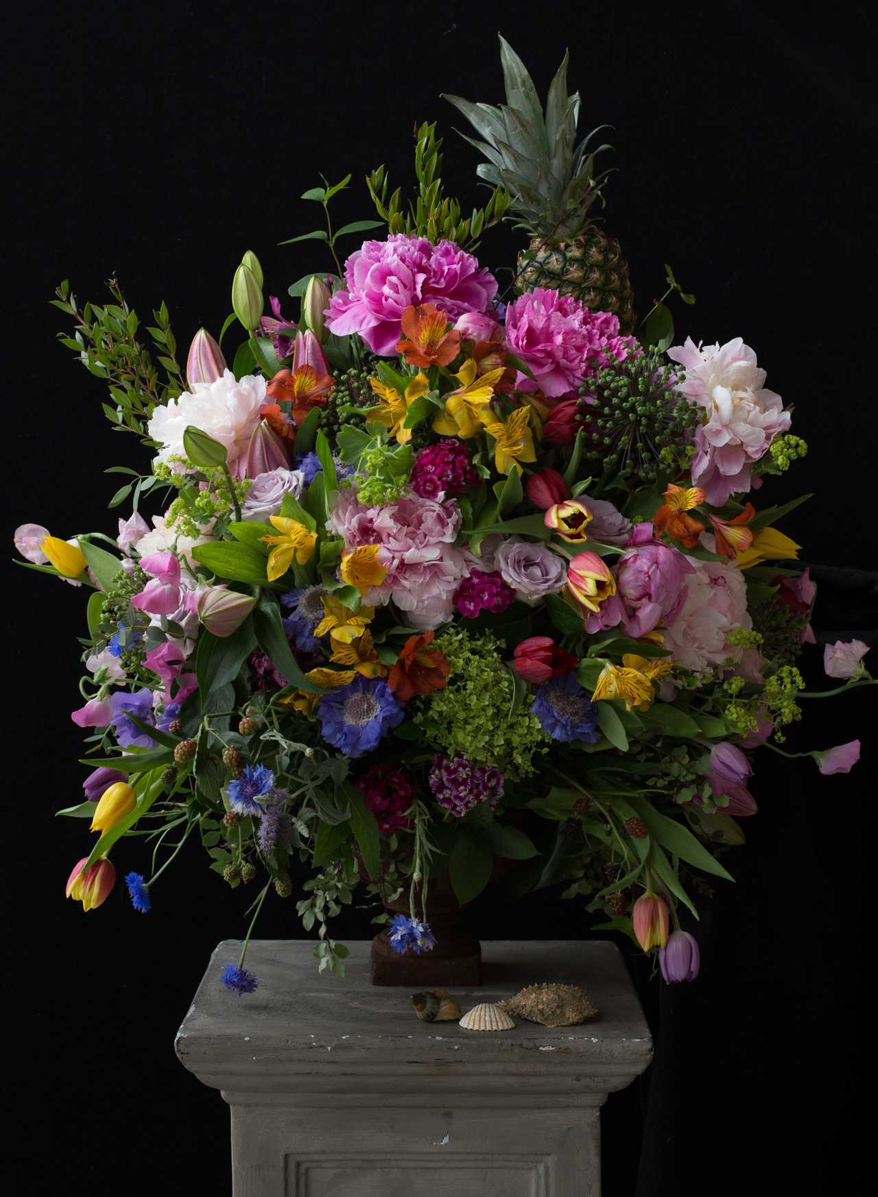
(Pay careful attention to the pineapple. Included for authenticity at great physical risk to the florist.)
So why do we describe arrangements like my urn at the top, as 'Dutch masters style'? It probably has nothing at all to do with the flowers, and (I'm delighted to say), everything to do with the photography. The Dutch masters style of lighting flowers was very dark, and had a very strong central highlight with the perimeter fading to shadow in a very unnatural way. It's almost impossible to recreate this light in camera, but with some Lightroom help you can have a shot at it:

What's key about this set up is:
1. Strong side/top light.
2. Artificially enhanced central highlight.
3. 'Fade' effect applied to get the milky blacks.
4. Colours desaturated to mimic the faded paints.
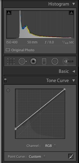
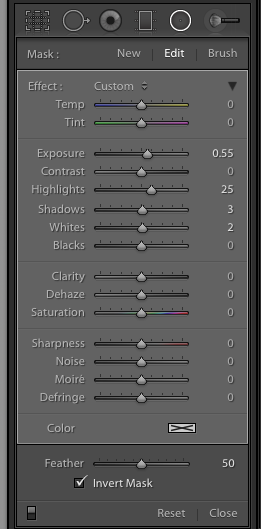
If you want to have a go, here are all my Lightroom settings:
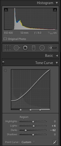
The first panel shows the darkening of the dark tones by dragging the 'Darks' slider to the left in the Tone Curve panel.
The second panel shows how to get the milky black fade effect - select a Custom curve in the Tone Curve panel, and drag the black point up the left-hand axis.
The radial mask shown last was applied over the central scabious. The Exposure and the Highlights were increased very slightly.
A Year With My Camera
Join my flagship online, free, photo workshop here:
