

What settings do you need for a faded photo?
The easiest way to get the moody faded look is with the app VSCO. If you prefer working on your desktop, VSCO also do paid presets for Lightroom and ACR (but it's not that hard to approximate the edits and save your own presets. At the end I'll show you the Lightroom edits that give you a similar effect to the VSCO HB2 filter).
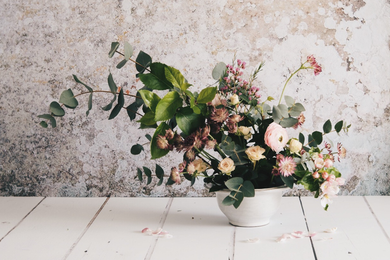
Original image:

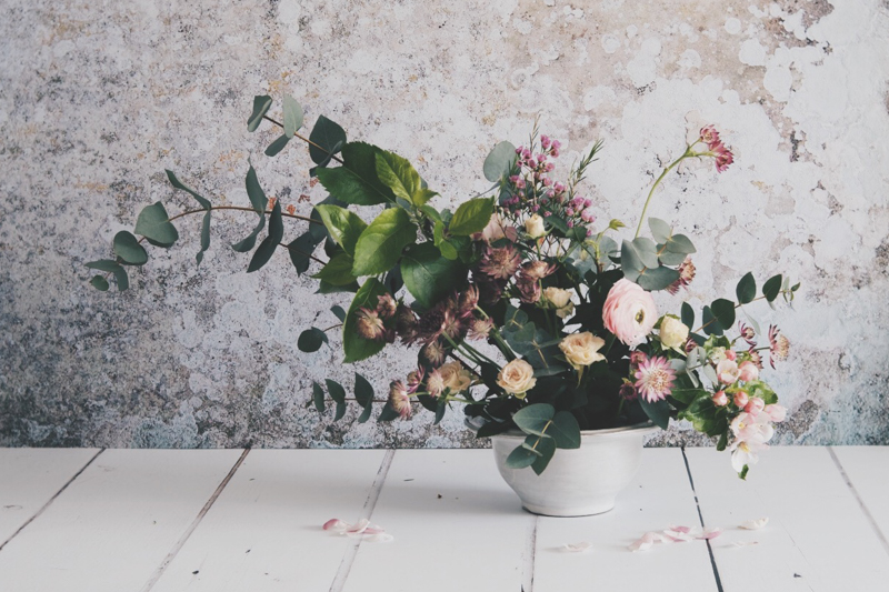
Start with Filter HB2:

VSCO HB2
Warm it up or cool it down:
VSCO HB2 +1.5 temperature

VSCO HB2 -1.5 temperature
Try the all-important washed out faded VSCO look:
VSCO HB2 +5 fade
Combine the effects you want, try changing the saturation and the contrast. Once you have a filter you like, did you know you can copy it from one image to the next to save you having to tweak every image?

VSCO HB2 +0.5 temp, +4 fade, -3 saturation, +1.5 contrast
Be careful with paler photos - you might want to start with a filter like A5 instead.

Free photography workshop
The email version of my beginner's photography course, A Year With My Camera, is free. Try it here. Join now, get started today:

Imitating VSCO HB2 in Lightroom
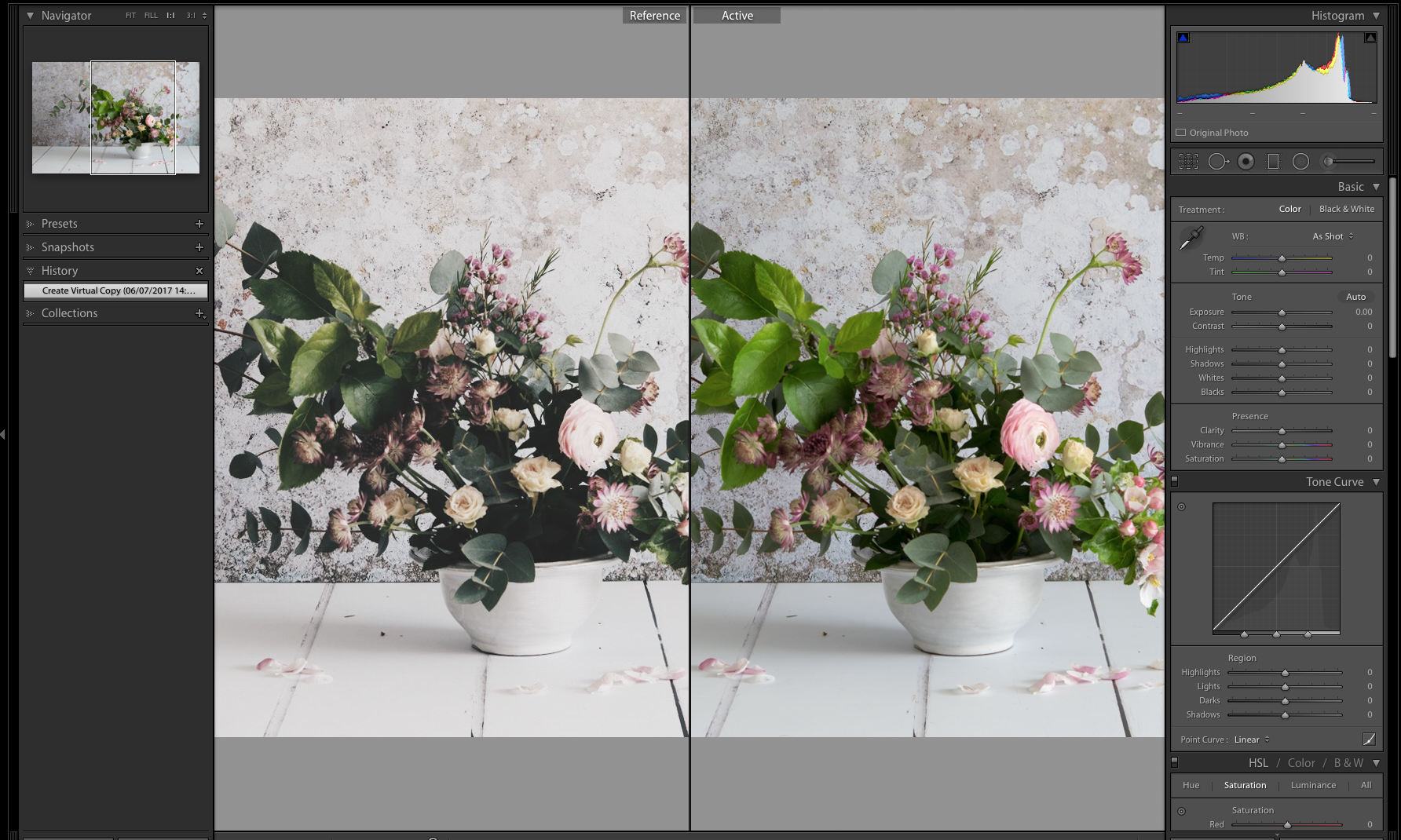
Scroll through this gallery of Lightroom screenshots to see all the slider positions I used to get an approximation of the VSCO HB2 filter:
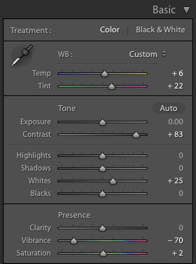


VSCO HB2 is on the left. Mine (on the right) is a little cooler. Play with the temperature slider, and split toning panel to fine-tune.
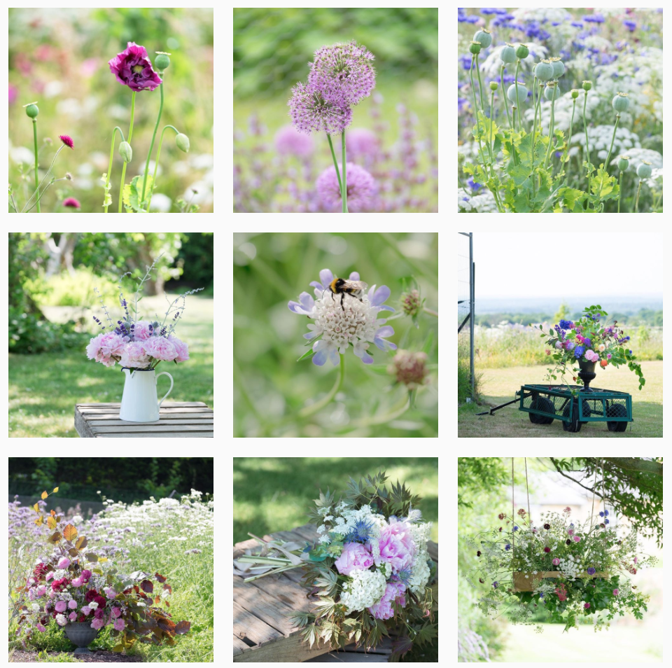
Consistent editing on Instagram
If you want to be big on Instagram, you need a consistent grid. The most successful accounts have a recognisable style of editing - think dark and moody, or bright and airy.
I learnt this from Me & Orla's free 7 day instagram workshop (just one of her actionable tips - I recommend you take it if you haven't found her yet), and I can attest to the fact that if you keep your editing and photography similar for each photo you post, you will get more followers. And, whatever the gurus say about followers not being important, I actually want more followers for credibility and visibility.
However, I would die of boredom if I had to stick to one style of either editing or photography for more than a fortnight. My compromise is that I do stick to a consistent edit or colour scheme, but only for 12-15 photos. Then I change it up:


I'd be delighted if you would follow me on Instagram. @EmmaDaviesPhoto for florals and landscapes, and @AYearWithMyCamera for my free beginner's photography workshop.
This post is one in a series about fine art flower photography. If you enjoyed it, you might like the others too:
