Today's prompt in the 30 Days of Composition challenge is "balance". More than a couple of people have asked me for a detailed explanation of what balance means in photographic composition, so here goes.
Any element of your image can be balanced (or out of balance).
The most common is to balance your subject with another physical element in the frame. But you can also balance tone, texture, colour, shape and even the emotion or message behind your image.
The subject (the houses) are the brightest element in the image, and so carry greater visual weight. They are balanced by the vast expanse of sky which echoes the white. It's not a 50:50 'space taken up in the frame' balance - it's a counterpoint of tone and texture. It's also a balance of man-made vs the natural world, the insignificant vs the universe, the transient vs the permanent, if you want to go that deep.
This is a very simple set of balances. 1: colour - earthy greens and earthy browns. 2: texture - soft ferns and hard bark. 3: shape - meandering ground and strong verticals. Notice there are no strong highlights or shadows, nothing to distract or draw attention away from the stillness.
How to balance your image
For a harmonious balance, you would arrange your image so that no single element overpowers another. This can be interpreted literally, in terms of space each element takes up in the frame. It can also be viewed in terms of "visual weight", or the psychological weight humans attach to an element. For example, red things will hold more visual weight than grey. Or faces will hold more visual weight than abstract patterns.
Imagine this image with just the stag. Does the doe add counterpoint in a balanced way, or does she distract from the subject?
What's the subject here - the flowers or the house? Each is balanced against the other, but does one win? Are the flowers too overpowering?
You might choose to have an unbalanced composition. These images can have a tension that is missing from a balanced photo, but they can also feel very wrong.
One exercise you can try for a simple shape balance is this: keep an eye out for your subject, and see if you can balance it with something else on the other side of the frame. Imagine a set of scales, and try to keep them level in your imagination, with your subject on one side, and the balancing element on the other.
Another way to practise this is to balance tones or textures across the whole frame. If you have one area which is very dark, or very textured, balance it with a paler area or a smoother area.
This image balances the saturated colour of the evening sky with the silhouettes of the jumpers and the bottom fence/hedge detail.
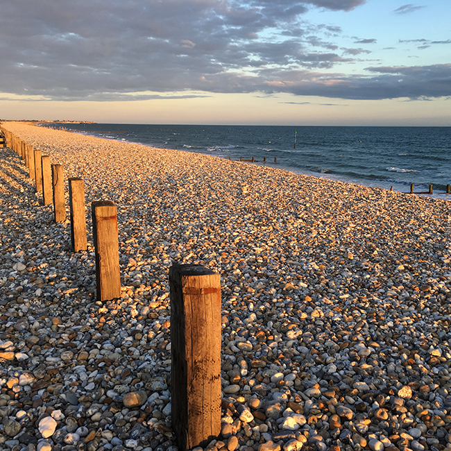
The monotonous texture of the pebbles is balanced by the wooden posts, the sea and the sky.
A last tip: try covering up the balancing elements in your image (you can do this on your LCD) before you take the shot. Is the image stronger with or without the balancing element? You don't want something that will draw too much attention away from your subject - just something to act in a supporting role.
Join my online weekly free beginner's photography class here:


